Bringing Brighton Pier to Life: The Story Behind Our New Artwork
There’s something about Brighton Pier that always feels full of life. The lights, the laughter, and that sense of excitement as you walk towards the sea!
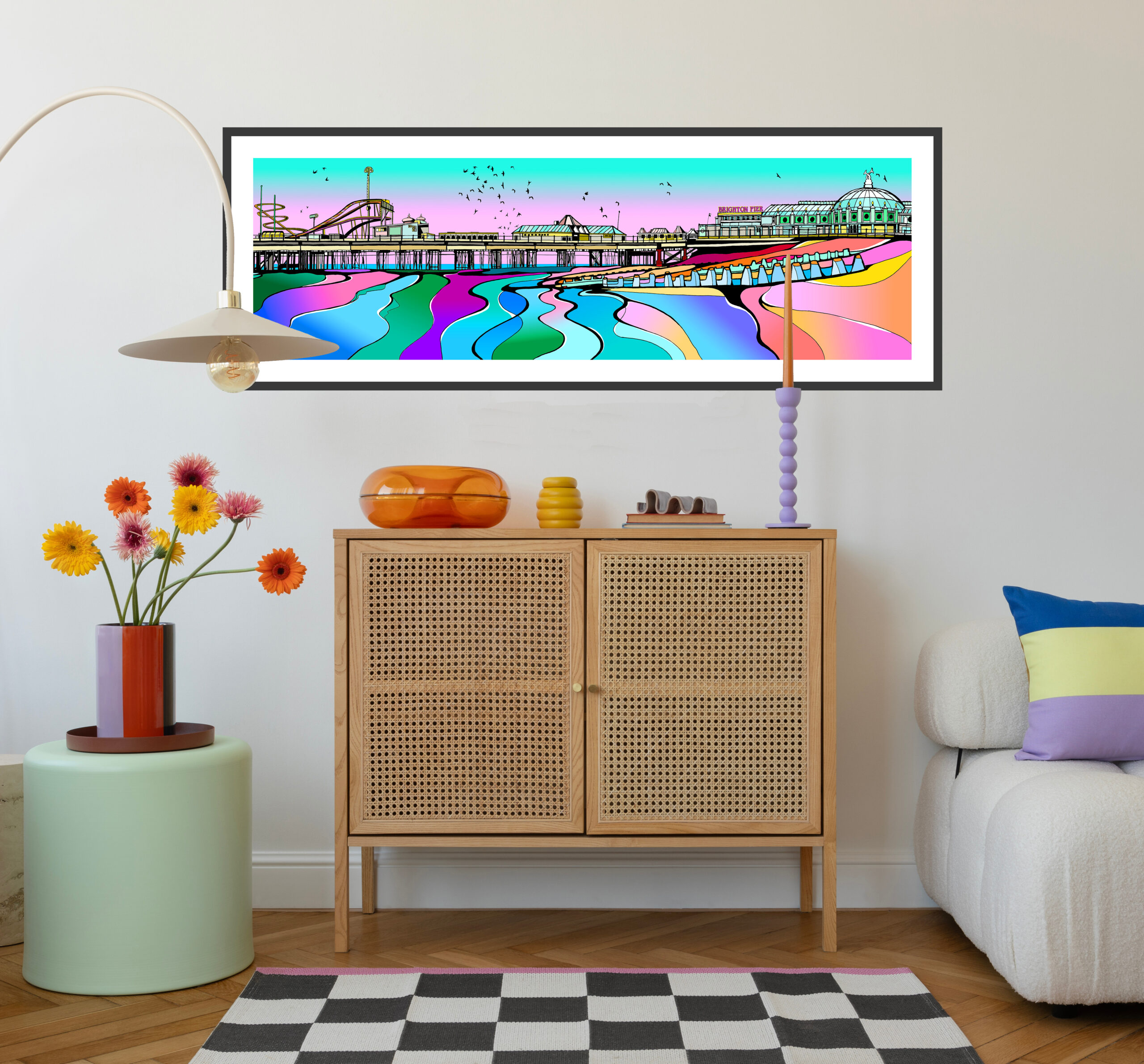
When creating our Brighton pier piece of art, we really wanted to evoke that vibrant feeling by using bright, cheerful colours, which luckily, fit perfectly with our Two Faced Twins art style and colour palette.
We used to visit Brighton Pier during our childhood, walking along with candyfloss in hand, appreciating the music, the sea air, the sparkling sea views, and of course going on the Palace of Fun fairground rides!
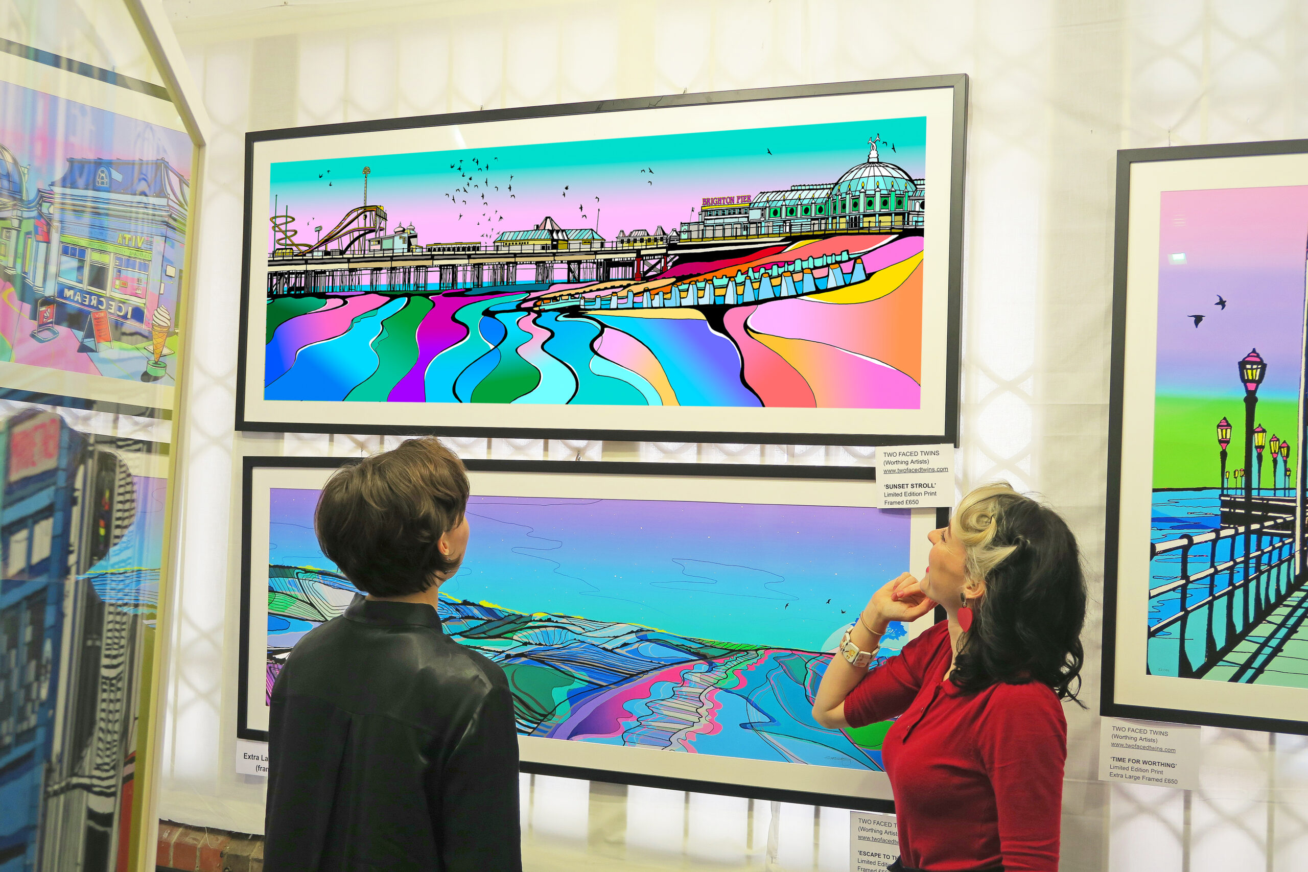
We had quite a tricky challenge to overcome when creating this piece. Brighton Pier is so long, (like, REALLY long) that we had to use a bit of artistic licence and carefully choose which sections to include in order to fit the whole pier onto the page. It is a panoramic piece of art, but it can only be so long before it starts to look too stretched and thin. Over the years, we’ve learned what proportions feel the most visually satisfying, so we focused on keeping the most eye-catching and recognisable parts of the pier.
We were also really keen to include the thousands of beautiful starlings that gather at Brighton Pier to perform their stunning murmurations from November through to early March. Even though our scene feels very summery (the colours definitely reflect that warm, bright time of year) there was no way we could leave out the magic of the starlings sweeping across the sky!
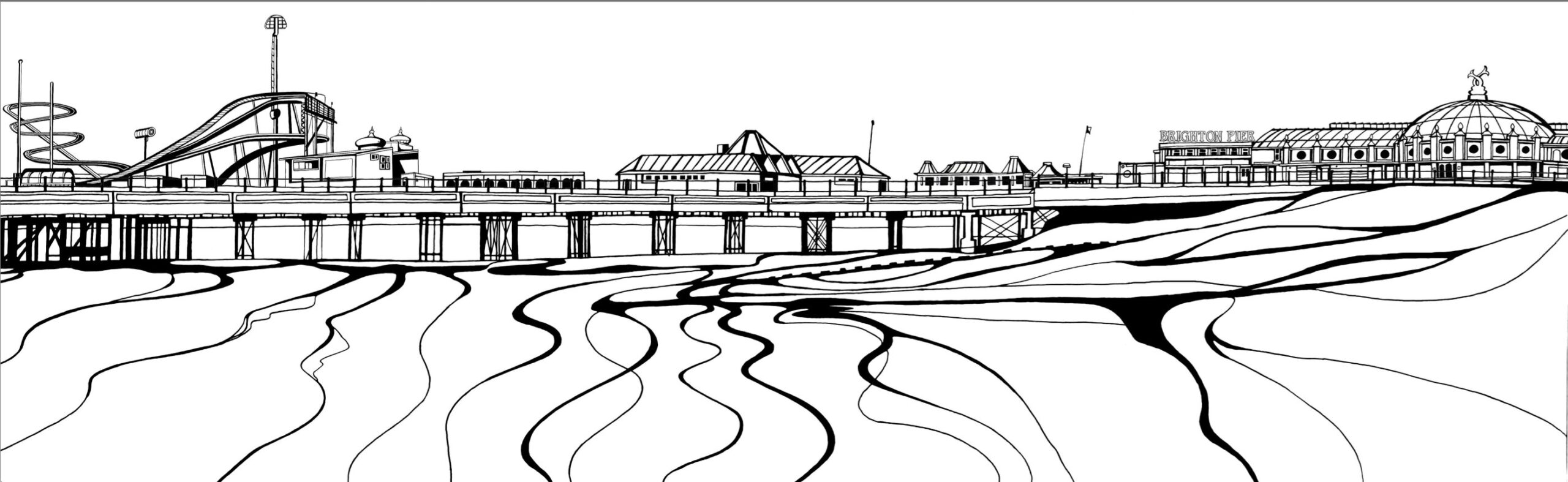
Creating this piece was a real labour of love. Stella spent around two weeks drawing all the intricate details, carefully building up each section of the pier. Then came the colouring stage…
Colouring the pier took another couple of weeks as I worked on it digitally, trying multiple colour experiments and variations, especially when it came to choosing the sky. That’s always the part I find most difficult – deciding what colour the sky should be! It finishes the whole piece off so it can feel like a lot of pressure to get it just right.
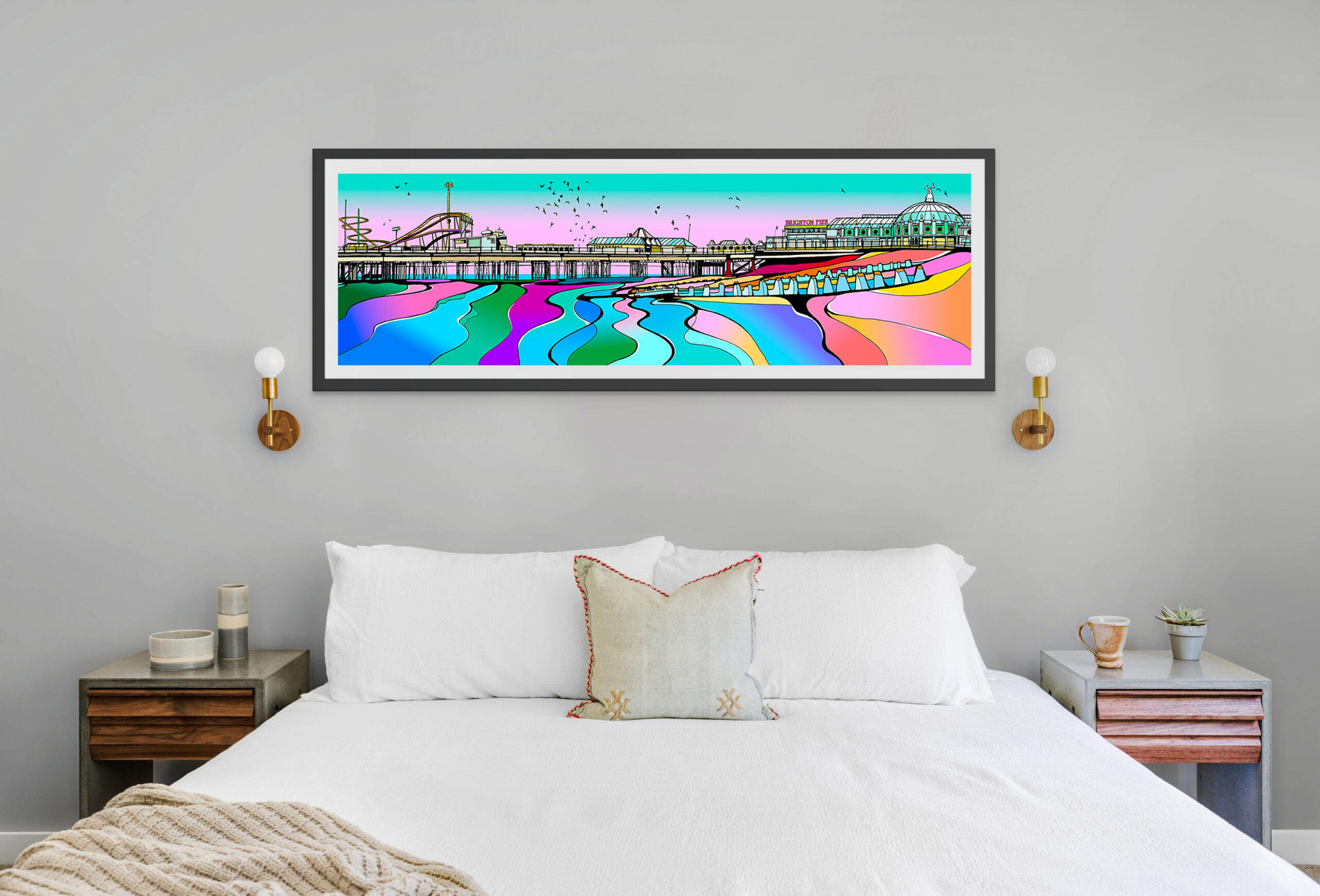
We also wanted this to feel like one of our signature pier pieces! One of the things we love most about creating pier scenes is the contrast between the straight architectural lines of the pier and the beautiful, flowing swirls of the sea. That contrast feels like such a signature part of our style, and it always brings a sense of movement into the piece.
When we imagine this artwork in a home, we picture it sitting above a sofa, where the long panoramic shape feels completely at home. The colours bring energy into a room, while the starlings drifting overhead add a sense of calm and movement. It really feels like a piece that carries a little bit of the seaside indoors.